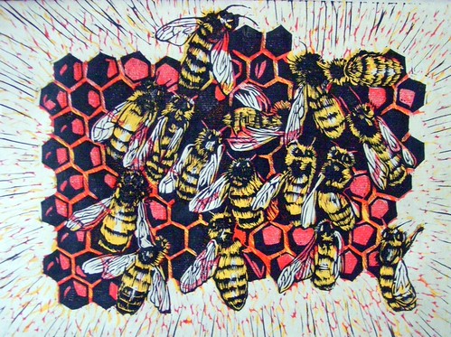
Well, here is the very first multi-color print. As of right now I officially hate it. I have no color control, it is just so flat. Using blocks like this gives me harsh, vivid colors with stark contrasts - NOT what I want at all.
I think I will try three things: #1 changing the red to a sepia, #2 just printing the yellow and black blocks, or #3 using the same blocks but with watercolor and Nori paste on damp paperfor a softer look.
I'm torn between adding this as one of the entries to the Rockford Midwestern (due this Friday) or not. I've spent so much time and effort into getting this prepared as an entry, but I just absolutely hate it. It doesn't reflect what I am trying to say. Dang it! I feel like I've wasted my time, my money on materials, and my effort. This is very disappointing.
10.11.2009
Honey Bees
Subscribe to:
Post Comments (Atom)
4 comments:
Hang in there, Erin! The design is really strong - it looks great in black and white. I'm sure one of the three options will work out.
I can totally relate to the disappointment factor. I feel like I have it on almost every print I do! You see it one way in your head while you are carving and then once you go to print it doesn't translate to paper like you expect. It's bad with reduction prints, especially once you are about halfway through, and then you realize that one of you first or second impressions was wrong (usually not dark enough in my case) and you can't go back. I'm always torn between tossing in the towel or sticking it out and letting whatever happens happen.
My first couple of reduction prints were with a brayer and I was MUCH happier once I switched to brushed on ink. Also, do you ever use Sekishu? I think the edges are softer with it.
Good Luck!
Andrea
I agree with Andrea. If you don't absolutely love the results from the 3 other attempts, please still turn it in, if only in just black and white. I think the design is strong and can stand on it's own.
Which do you think is the strongest piece out of this listing:
Ellison Bay
OR
Fly on a Pitcher Plant
OR
Honey Bees
OR
Singing Frog
I don't know, tough decision as I like them all. I think for me it is between Ellison Bay and the Honey Bees. The bee print is such a strong design and carved with sooooo much detail. But I'm biased because I really like the graphic style you use on the trees. It feels loose and flowing and representational...if that makes any sense. Stylized as opposed to illustrative, maybe... I'm looking at it right now, and it is lovely :)
If it's a submission for a show, just from my limited experience, you can never tell what the juror is going to pick. The two pieces I got into juried shows this year were the ones I thought were the weakest out of the five I submitted. Which also shows that my opinion might not be worth much!
Post a Comment